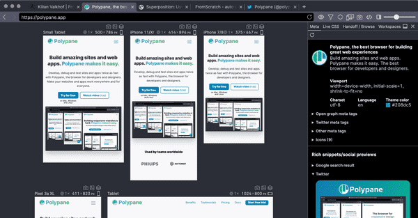
With responsive design come a lot of new terms and concepts and there wasn't really a single place that listed them all with explanations in plain English. So we created one. No super long articles that bury the explanation two thirds of the way in, but the shortest, clearest explanation we can give. If something can be explained in a single sentence, a single sentence it is, no need to waste your time!
In plain English also means that we didn't write it to become the Wikipedia of responsive design. The term and explanation are to the point and sometimes opinionated. We want you to do the right thing, even if there's a term for the wrong thing!
After you get the introduction and explanation of a term, you're more than welcome to dive into deeper explanations and articles (and we link a few of them we particularly like) but that's up to you.
Go check out our Responsive Design Glossary and if you like it, please share!
