Documentation
Learn how Polypane improves your workflow
Color Picker
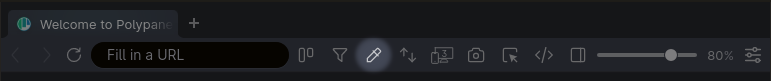
The color picker eye dropper lets you pick colors from anywhere on the screen, and it's available right from the address bar by clicking the eye dropper icon. After picking a color, it will automatically be copied to your clipboard and added to the list of selected colors, available in the elements panel and other color selectors in Polypane.
You can also start the eye dropper with ⇧ ⌥ p to pick a color. While in eye dropper mode, press Esc to cancel.
Video overview
Color Picker UI
After having selected a color the Color Picker UI will open. You can also open this by right-clicking the icon in the menu bar.
The top row contains a separate eye dropper button, a color palette button, a screenshot button and three dropdowns:
- Choose between AA and AAA minimum contrast levels, or the new APCA algorithm.
- Choose to test for small text, large text or non-text contrast.
- Select the color notation you want: hex, rgb, hsl or hwb.
With the eye dropper button you can pick a color from anywhere on the screen, and the palette button lets you select using a traditional color picker, along with tints and shades for the currently picked color and an overview of previously picked colors.
The screenshot icon creates a screenshot of the swatch that you can use to share with your team or add to reports.
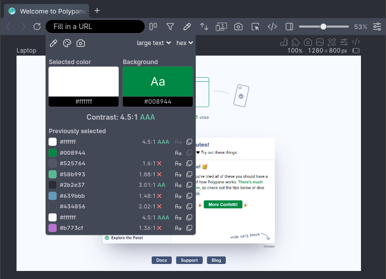
Selected color and background
Below the top bar are two large color swatches: your most recently selected color and the background to check it against (by default the previously picked color). The background swatch will show the text in the selected color on top of it for you to compare, in a font size that matches the "small" or "large" text chosen. Click on these swatches to copy their color.
Suggests improved colors
Below the two swatches we show the contrast along with whether or not it passes the WCAG AA or AAA score for the selected text size. When a color does not have enough contrast with the chosen background color we'll show a small square in the swatch with the closest color that does have enough contrast (using the same algorithm we use in our color contrast debug tool). Clicking it will update your selected color.
Previously selected colors
Below that we show an overview of the 9 last selected colors. The contrast of each color is scored against the currently selected background color.
Click a color to copy it, click the "Aa" icon to set this color as the selected color or the background icon to set it as the background color to compare other colors to.
These colors are also available in the color selector in the elements panel.
Swatch screenshots
The swatch screenshot can be used to share color combinations along with their contrast score. It will contain the color in the format you have selected, along with the suggested color.
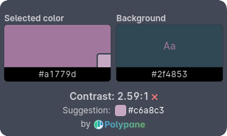
These are ready to be shared with your team in tickets, or can be pasted into auditing reports. The file name is a suggestion for the alt text.
Color palette picker
The color palette picker is the same color picker that you can find in the elements panel. It lets you pick a color using a traditional color picker, along with tints and shades for the currently picked color.
The color picker will show three lines depending on what contrast ratios limits you have chosen: AA, AAA or APCA
- AA and AAA: lines are for 3:1, 4.5:1 and 7:1
- APCA: lines are for Lc 45, Lc 60 and Lc 75
The line that is highlighted is the one you should meet for the settings you have picked in the color picker UI: AA, AAA or APCA contrast for small, large or non-text.
Have a question about Polypane?
Contact us any time though chat, Slack or our contact form:
Contact SupportBuild your next project with Polypane
- Use all features on all plans
- On Mac, Window and Linux
- 14-day free trial – no credit card needed

