Documentation
Learn how Polypane improves your workflow
Customizing Polypane
Though Polypane doesn't have a traditional settings panel, there are still plenty of ways to make Polypane your own and configure it in a way that works best for you. While interacting with the interface, Polypane will remember your choices where that makes sense.
This guide assumes you've read through the Intro to Polypane and UI Overview docs.
Picking your preferred color scheme
Polypane comes in both a dark and light mode. On first launch of the application we'll automatically match your OS, but if you want to change that you can press ⌘ i to flip from light to dark mode, or the other way around. You can also find "Toggle Dark Mode" in the global View menu.
Customizing the workspace
In the workspace, you can change the layout, the number of panes and whether or not you want to show an explicit "Add pane" button.
Choosing a Layout
The workspace is the central area of Polypane, containing your panes. The first way to customize this is to choose a layout:
- Horizontal shows all panes in a single horizontal row.
- Vertical shows all panes wrapped to multiple lines.
- Focus mode shows a single pane (similar to how regular browsers show emulated devices).
- Full mode is like a regular browser, where the site takes up the full area.
To switch between these, click the Layout icon, directly to the right of the address bar.
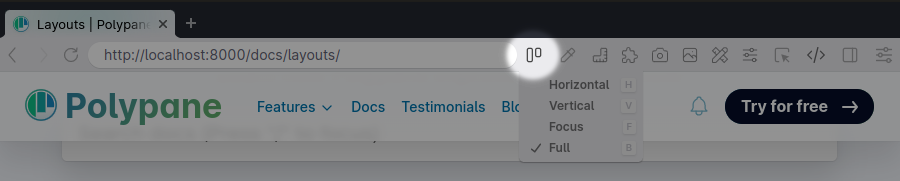
Here you can also see the shortcuts: press h for Horizontal, v for Vertical, f for Focus and b (for browser) for Full mode. This lets you quickly switch between them without using your mouse. Small tip: if you have a pane focused, first press Esc to clear that focus before using a shortcut.
Customizing the set of panes
The easiest ways to add a new pane are to double click anywhere between panes that you want to add a new one, or to click the + button at the end of your list of panes.
To remove a pane, hover over the pane header and an x will appear in the top right. Click it to remove the pane.
When hovering the header, you'll also see one or two arrows that let you re-order panes, and a + button that will let you duplicate a pane with all its configuration.
Read more about managing the number of panes and changing the size of panes.
Hiding the "add pane" button
If you don't want to show the add pane button on the workspace at all times, you can hide it by going to the Settings menu in the top right of the application and unchecking "Visible Add Pane Button".
Customizing the new tab
You can fully customize how new tabs appear in Polypane. You can set a default layout, default set of panes or completely overwrite the new tab.
Picking a default layout
To change which layout is used for new tabs, right click the plus button in the tab bar, then pick the layout you want to use for a new pane. From now on that layout will be used for all new tabs. You can see which one it is by looking at the checkmark in this context menu.
If you don't want to use multiple panes by default, switch it to focus or full mode and you're good to go.
Configuring a default set of panes
Each workspace has a small "home" icon that you can click to replace the default three pane view with for all new tabs. This lets you use your frameworks breakpoints, or a set of workspaces based on your analytics data (or any other workspace!) for all new tabs.

Setting the current tab as the default new tab
To create a fully custom new tab, configure your current tab the way you like with a URL, set of panes, debug tools and even the default Panel size and position, and if it automatically opens or not. Then in the File menu select "Set Current Tab as Default New Tab". All new tabs will now look exactly like this one.
Changing the text size of the UI
If you want to increase or decrease the size of the text in the UI, click "Adjust Text Size..." in the global View menu.
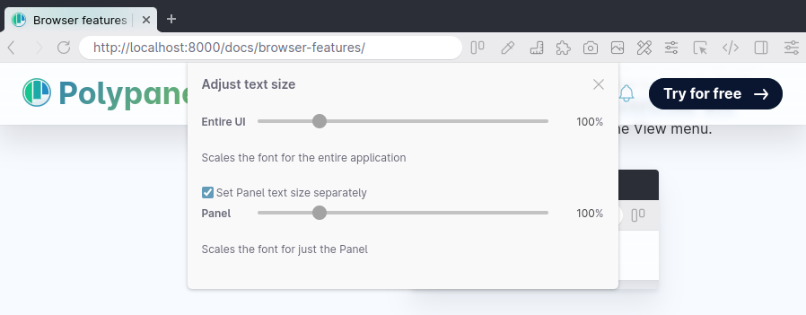
You can configure the text size of the entire UI and the text size in the panel separately.
Picking which devtools to use
Polypane comes with two sets devtools the Polypane developer tools and the Chromium developer tools. The Polypane developers tools work across all panes at the same time, while the Chromium developer tools can only inspect and edit a single pane at the same time.
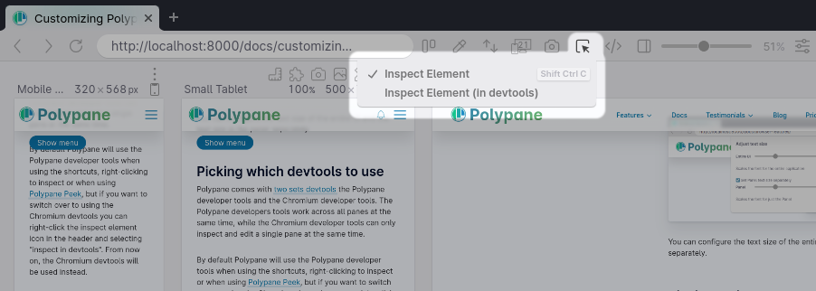
By default Polypane will use the Polypane developer tools when using the shortcuts, right-clicking to inspect or when using Polypane Peek, but if you want to switch over to using the Chromium devtools you can right-click the inspect element icon in the header and selecting "inspect in devtools". From now on, the Chromium devtools will be used instead.
Customizing the Panel location
The panel is where you can find many of Polypane's inspection and editing tools. By default, it opens on the right-hand side of the window, but you can right-click the panel icon in the header to set it to the bottom or left side, to to detach it into its own window. You can also click the panel icon inside the panel to pick a new side.
The layout inside the panel will automatically reflow to fit a horizontal or vertical layout, and for each tab in the panel Polypane automatically remembers which tool is selected.
Polypane will remember the selected panel for each tab and reinstate it for you when opening the panel again.
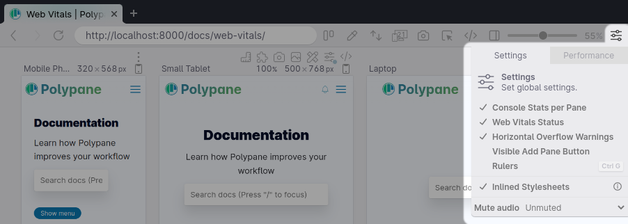
Configuring pane notifications
Polypane can surface information on the state of your panes in the info bar below each pane. Depending on what you're working on, you might want to show or hide this information.
Console information
By default, Polypane will show you the number of console messages, warnings and errors below a pane. This way you can keep track of how noisy the console is for each pane. If you want to hide this information, uncheck "Console Stats per Pane" in the Settings menu in the top right of the application.

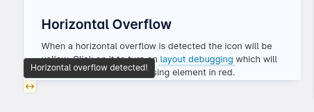
Horizontal overflow badge
When Polypane detects a horizontal overflow issue in a pane, it will show a warning badge that you can click to turn on layout debugging which will automatically highlight the elements causing the overflow.
To hide this button, uncheck "Horizontal Overflow Warnings" in the Settings menu in the top right of the application.
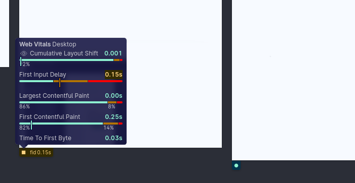
Web Vitals information
Turned off by default, Polypane can collect and show web vitals information for each pane and compare that to global CrUX data. To turn this on check "Web Vitals Status" in the Settings menu in the top right of the application.
Choosing what to sync across panes
By default Polypane syncs the following things across all panes: scrolling, hovers, clicks, keypresses, form input and form change events. Additionally, Polypane can keep the focused element in sync between panes.
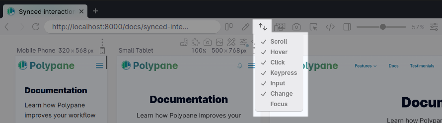
To enable focus syncing, or disable some of the other evens, you can right-click the sync icon in the header and check and uncheck which events you want to keep synced.
The above events should properly keep the URL in sync as well, but sometimes they don't, due to different UI's being used at different viewport sizes. As a last resort, Polypane loads the latest URL in all panes and keeps pages in sync this way.
Showing multiple pages in one overview
You can disable navigation sync per pane by clicking the options button above a pane and toggling the "Sync Navigation" button. This allows you to show multiple web pages side by side.
Common changes
There are a few common changes people want to make to better fit their workflow.
Make Polypane look like a regular browser
To make switching to Polypane easier you can initially configure it to look like a regular browser by doing the following things:
- Switch to the full layout
- Switch from the Polypane devtools to the Chromium devtools as the default
This will make Polypane look and behave very similar to other browsers, with the devtools you're already used to. From here you can start to explore the other parts of Polypane, like the different parts of the Panel, the various debug tools et cetera.
Starting with your frameworks breakpoints
If you develop your sites using a framework like Tailwind, Bootstrap or Chakra, you can configure Polypane to use their breakpoints for your default new tab panes. To do so, load them in the [workspace panel] and click the "home" icon for the one you want to use:
Polypane has these frameworks built in in the "Default" workspaces:
- Bootstrap The default Bootstrap breakpoints
- Material UI The default (simplified) Material UI breakpoints
- Tailwind CSS The default Tailwind CSS breakpoints
- Bulma The default Bulma breakpoints
In addition, we have a number of downloadable workspaces available, like Chakra UI, Ionic, UIKit and more in our workspaces documentation: downloadable workspaces.
Have a question about Polypane?
Contact us any time though chat, Slack or our contact form:
Contact SupportBuild your next project with Polypane
- Use all features on all plans
- On Mac, Window and Linux
- 14-day free trial – no credit card needed

